


We participated in the redesign of Sisi hotel chain brand This was an extensive change. It involved many of the components of marketing communication. The resulting redesign was at the end the result of close cooperation between several marketing agencies and the client itself. Cooperation has taken place fairly and productively.


The author of the logo was accessible to the philosophical and technical arrangements on our part. These consisted, in particular, of practical design requirements such as Sisi’s dominance in every form of logo application, modularity of individual elements and simplicity of shapes. The redesigned logo must, therefore, have met the following criteria:
The dominance of the "Sisi"
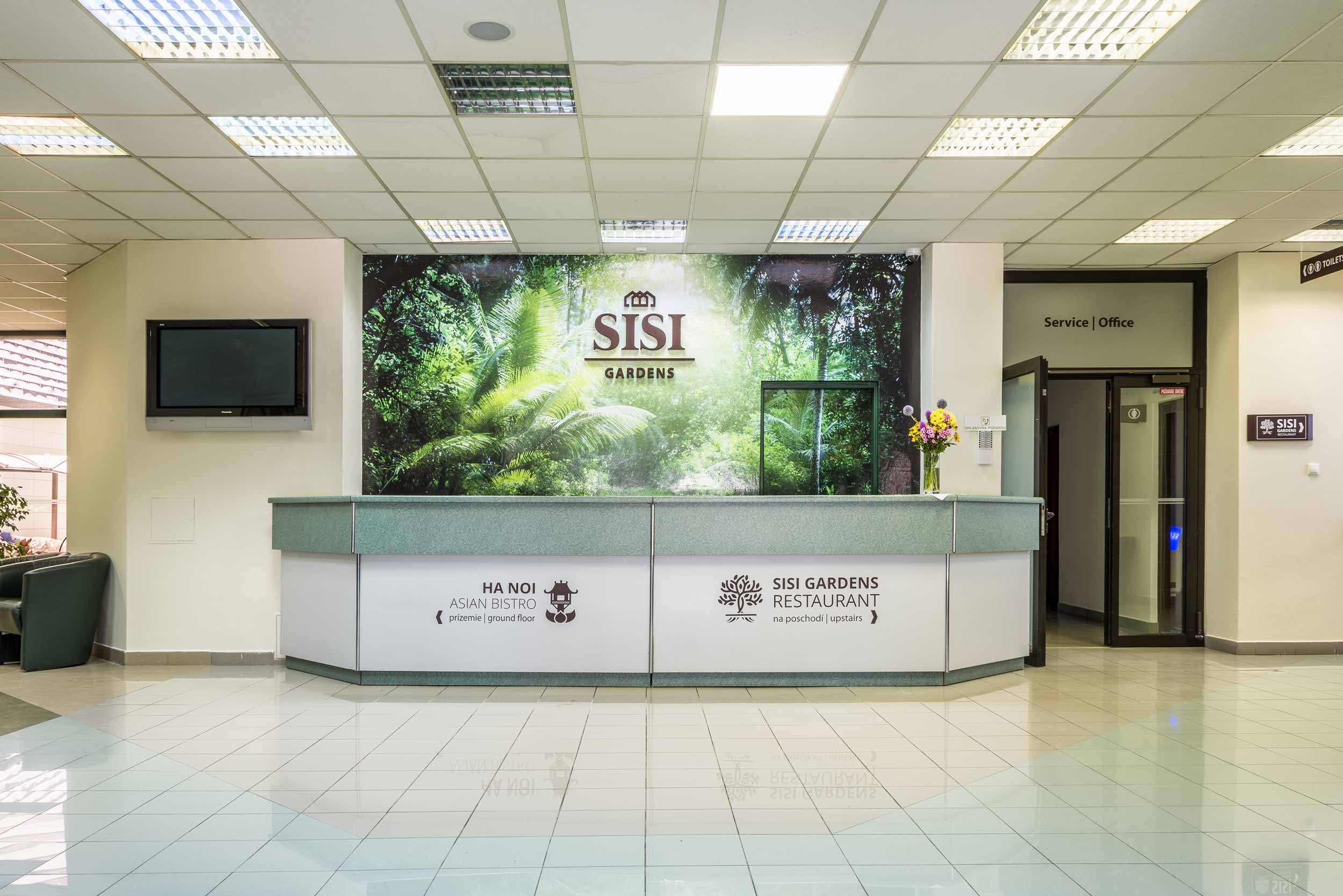
Each hotel from the chain, up to this point, has been branded somewhat differently. This we decided, after consulting the client, to change and brand all the hotels dominantly as Sisi. For every application from a business card, through letterhead, information panels in the interior to the logo on the building it had to be, first of all, clear that it is Sisi and only then came the name of the particular part of the hotel chain.
Modularity of individual elements
Under modularity, we mean that the individual elements of the logotype had to be separable, interchangeable and should work in stacked and linear versions. It is likely that the client will not stay with the current number of accommodation facilities and it would be needed to add more in the future. We had to put some thought into how to add more accommodations to the hotel chain later in the future.
Simple and solid lines
In order for the logo to be made out of plastic, the individual parts must have had clearly defined areas in the version with one as well more colours. The proportion between the size of the brand name and the hotel name had to be such that it could be easily read even from a distance.
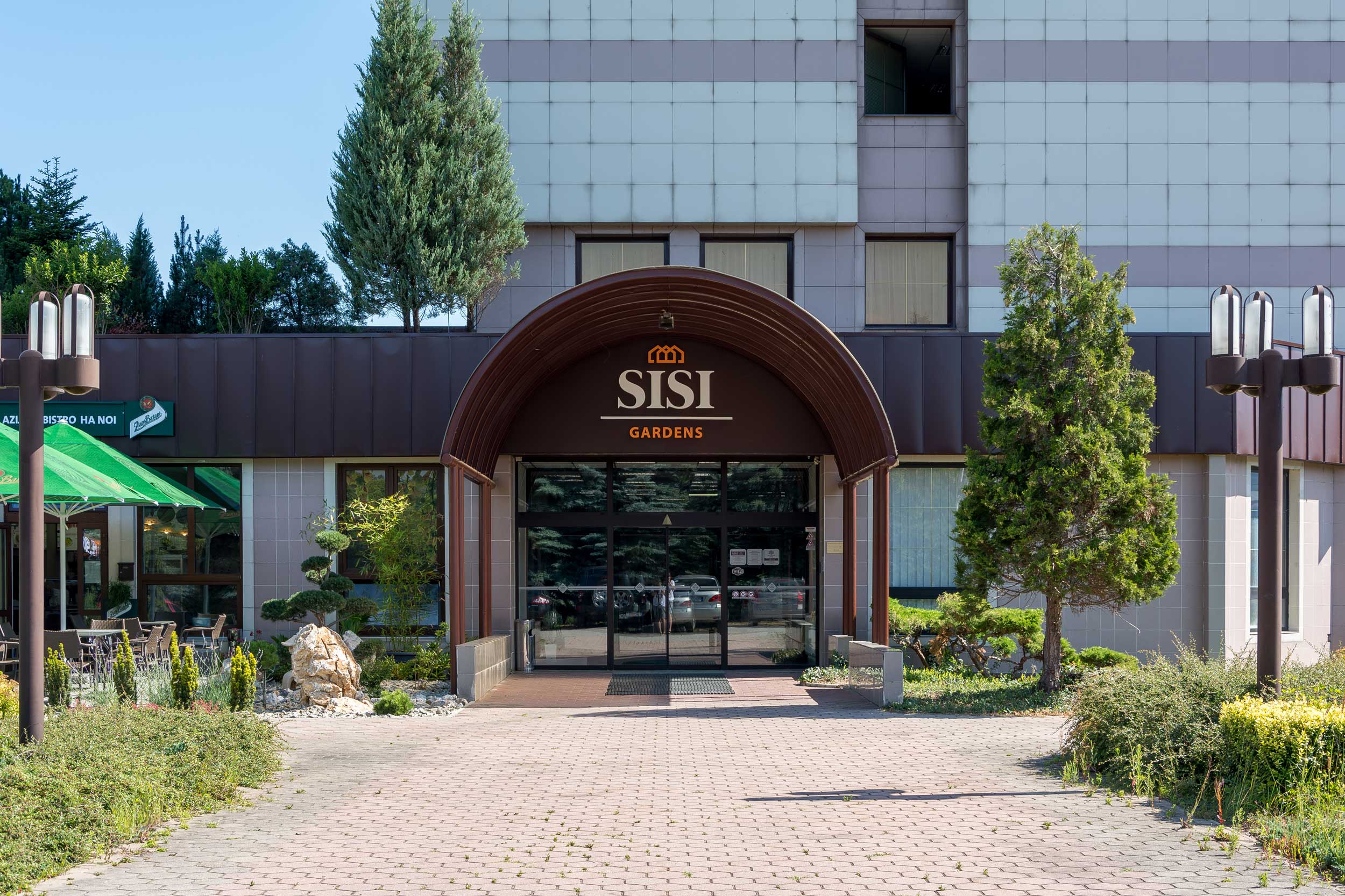
Even before we have prosed our first designs, we knew that the biggest challenge facing us will be to apply the logo on the façade of Sisi Gardens. Here we had to consider the aesthetic dimension, the desired visibility from a great distance and even at night and also the technological possibilities of assembly on the façade of the building.

After our participation in the brand manual, our work has not ended and we have embarked on the application of the logos. Each accommodation facility has needed new navigation boards for both exterior and interior. The change also went through all the prints. We have put a lot of effort into creating an animated version of the Sisi logotype, which we used in the corporate video and on the website.