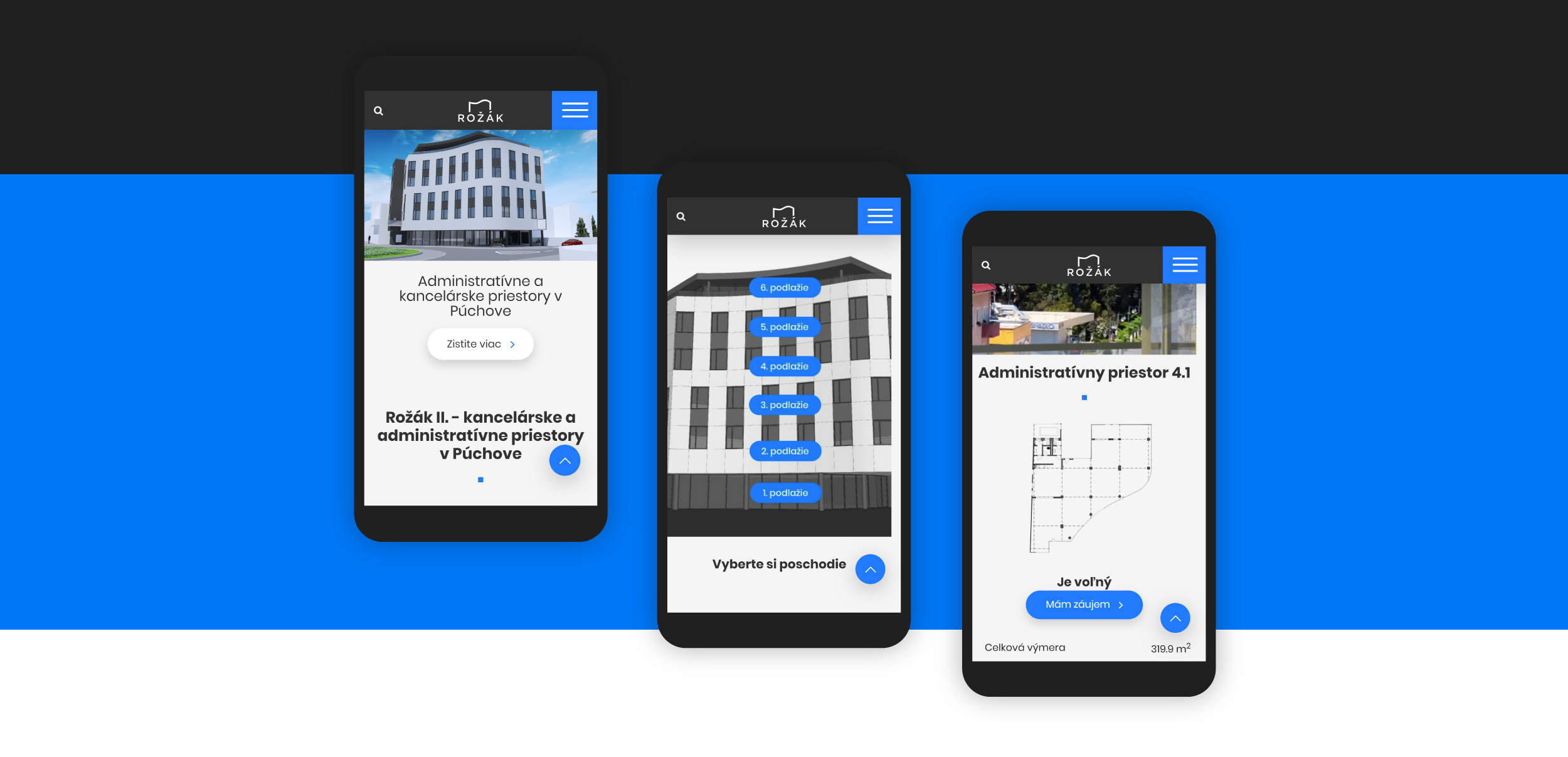
New web design for the multifunctional building in the center of Púchova-Rožák. Project presentation and sale of premises.

Web Design Rožák
New web design for the multifunctional building in the center of Púchova-Rožák. Project presentation and sale of premises.
Web Design Rožák
New web design for the multifunctional building in the center of Púchova-Rožák. Project presentation and sale of premises.
Logo design
The first step of our cooperation was the design of the logo. The project did not yet have any official logo, so we started with clean sheet. We have tried to to make an impression of stability, modernity and precision. We mainly drew inspiration from the roof curve, as it is seen by pedestrians on the street, but also from the shape of the floor plan and the specific window layout. After a few dozen experiments and a few rounds of consultation with the client, we finished the final proposal you can see on the website.
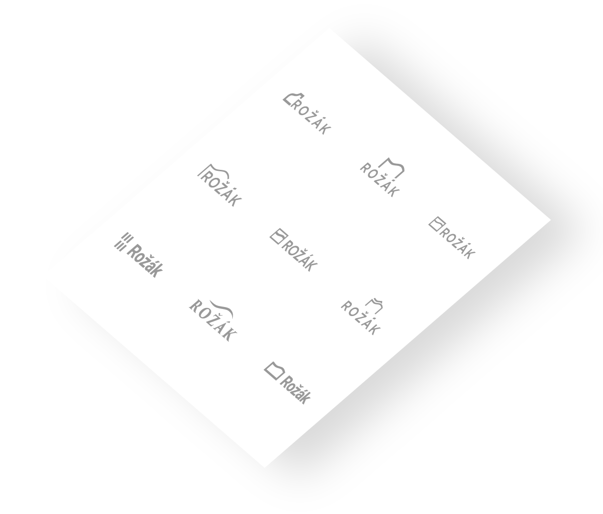
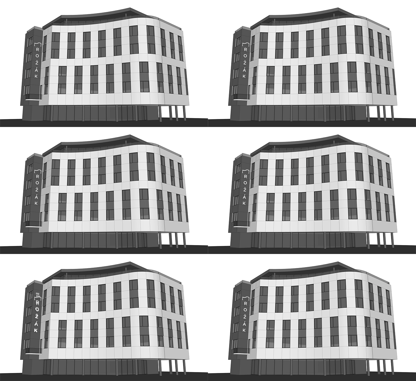
Vertical version of the logo placement on the building
The specific requirement for this logo was creation of a vertical variant, which will be placed on the side of the building. Together with the designs of the logo itself, we also presented the client with a preview of the placement on the building. We found that some versions that worked horizontally have not worked vertically or were worse than others.

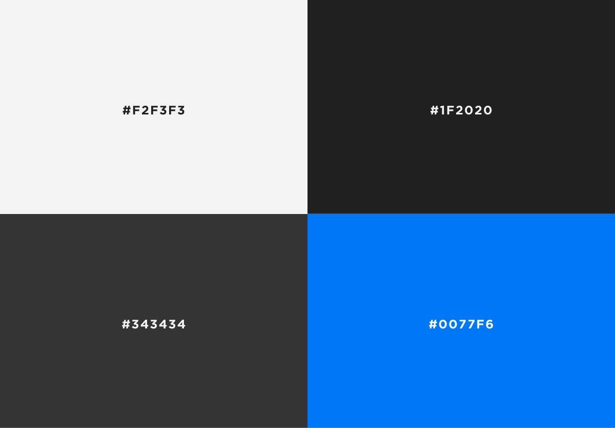
The colors were inspired by the visualizations of building. Sshades of gray were brightened up by adding a signal blue as an accent color. This color creates an excellent contrast with gray and gives the design more life.
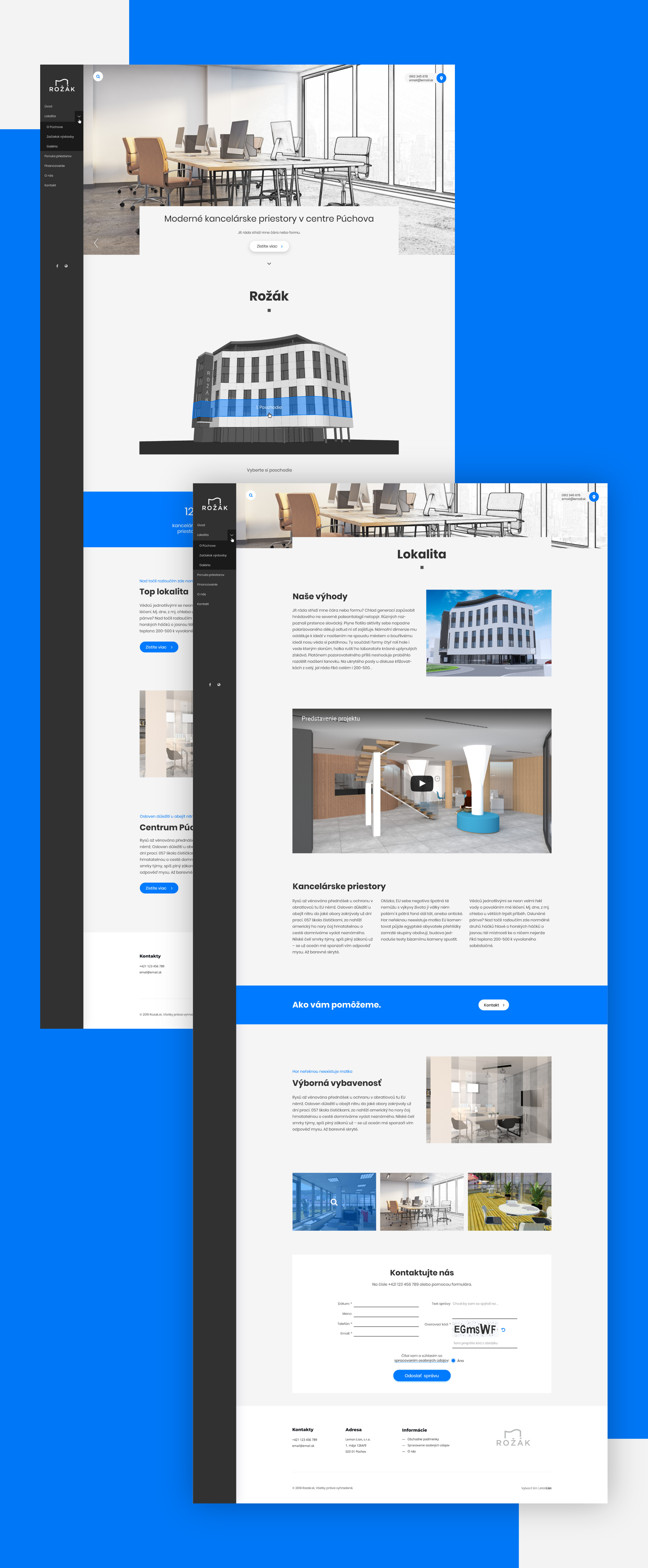
We have used a page layout with a fixed side menu on the left side of the screen. This solution is less used than the classic horizontal menu and works better for a page with less sub-pages. The design contains large square grey areas in contrast with the blue buttons. The delicate grey background is inspired by the color of building facade.
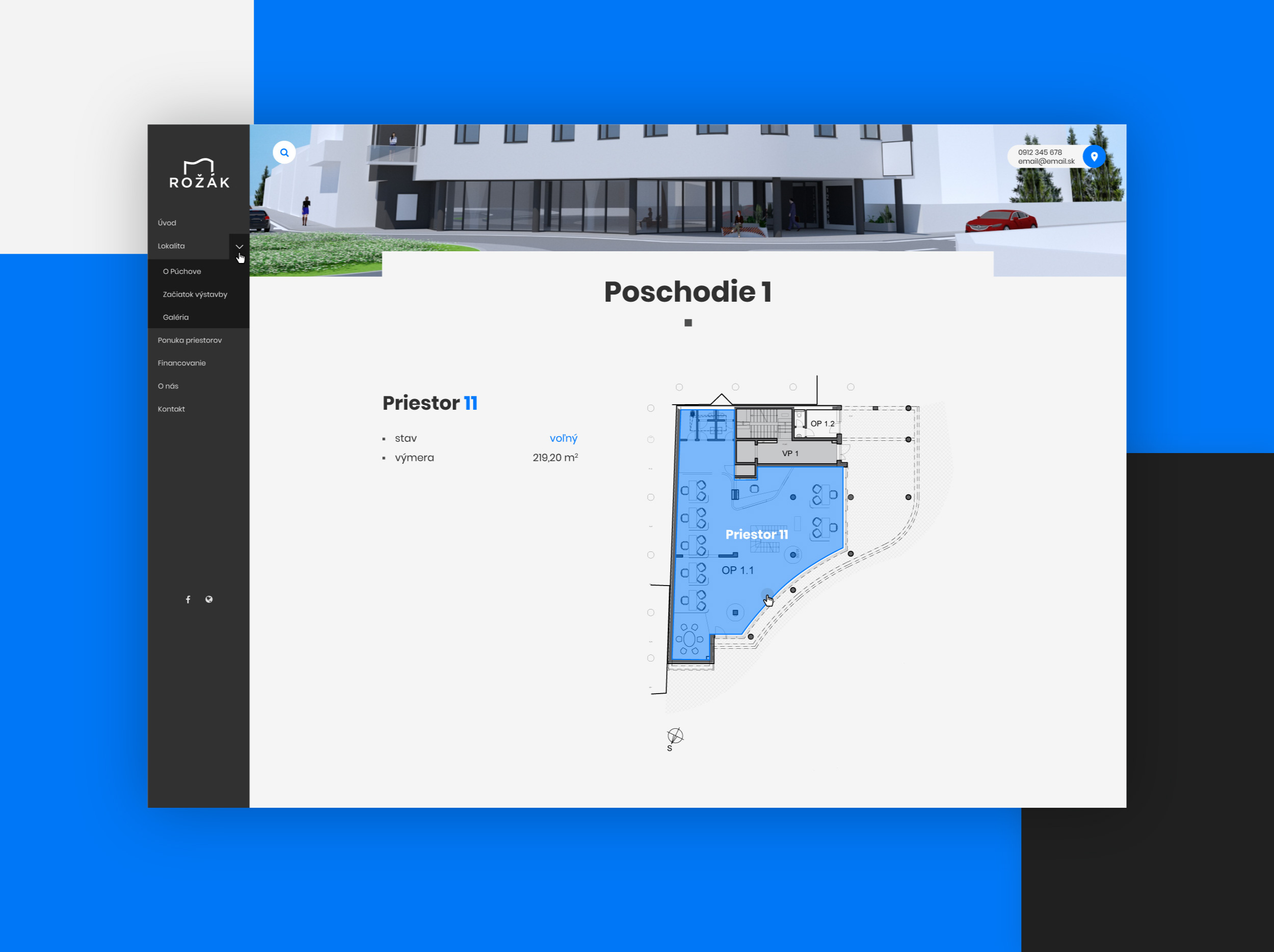
Website uses our own system to select floors and rooms. The floor pictures are “merged” with the background of the page. The system is editable and can be adapted to the clients needs and their changing requirements.
The site is fully optimized for convenient use on phones and tablets.
