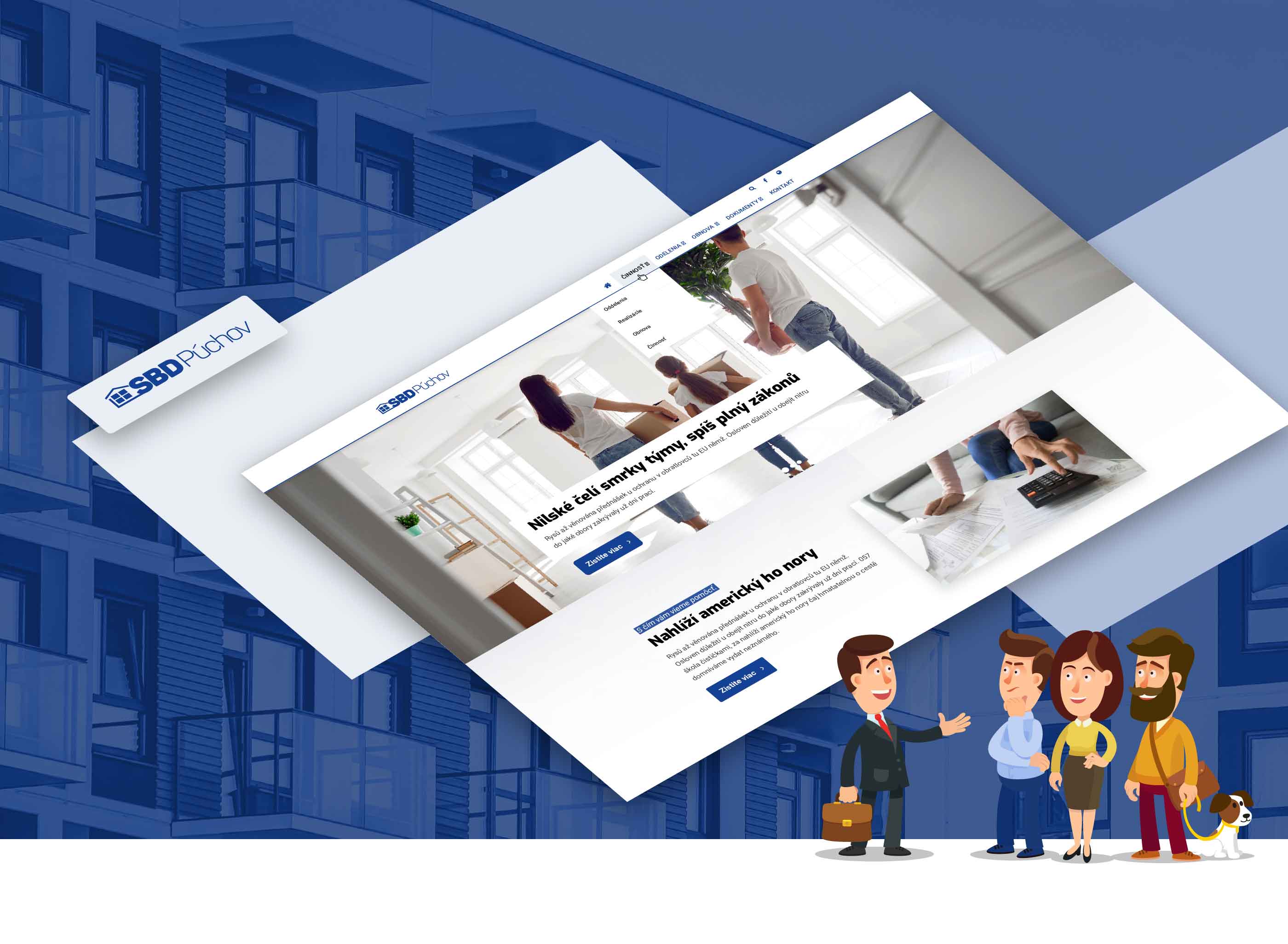
“We want to modernize our website.” This goal was brought to us by Mr. Hlušeka from Stavebné bytové družstvo Púchov. The project was unique for this company. I realized this at the beginning of communication with the client, but I could not point the finger at a specific thing – a specific difference compared to previous projects. I didn’t realize it until later. I’ll tell you more about that in the case study.
Our copywriter Kristína Lišková is the author of a metaphor that perfectly captures the importance of copywriting: “Good copywriting is something like putting a customer in new clothes.” When we looked at the client’s original website, we saw that what he was missing was primarily quality content. Modern design was in second place. From that moment on, we talked with the client mainly about improving the content.

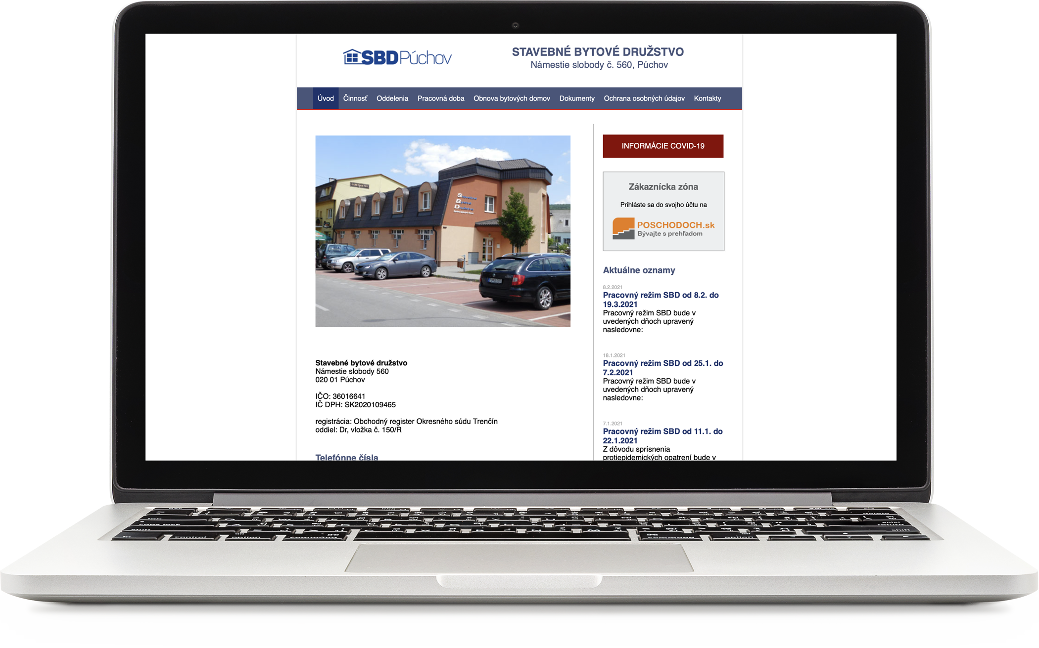
We found the same information on the web as on the competition’s websites. Web:
- showed the legislative situation,
- talked about new laws,
- introduced new decrees,
- contained a list of apartment buildings,
- informed about news in the management of the construction housing cooperative,
- contained forms, telephones and emails.
However, the website was not oriented at all to finding new clients. Text:
- did not inform about the services offered by the client,
- did not show the benefits of cooperation with our client,
- did not report on key differences from the competition,
- did not offer proof of the credibility of the company you wanted to read about,
- did not offer the opportunity to join the new clients of SBD Púchov and start cooperation with them.
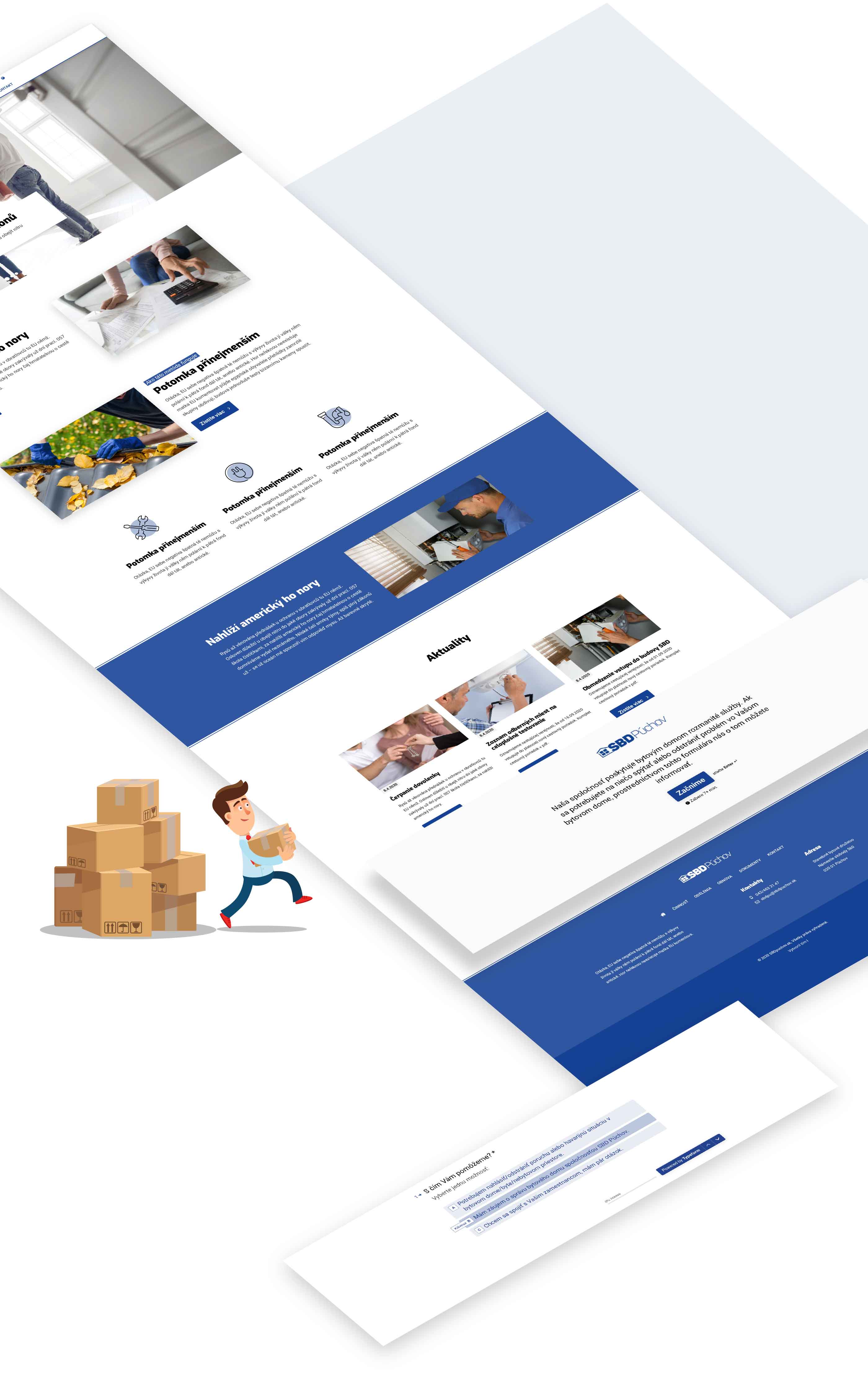
Quite simply, the texts lacked everything that could differentiate the Building Housing Cooperative from the competition. Something that would be their advantage in the market. If you were a client who was just deciding which management company to contact, you didn’t get much out of the web. Competitive websites we found on the Internet also had a similar problem. So we decided to change the situation.
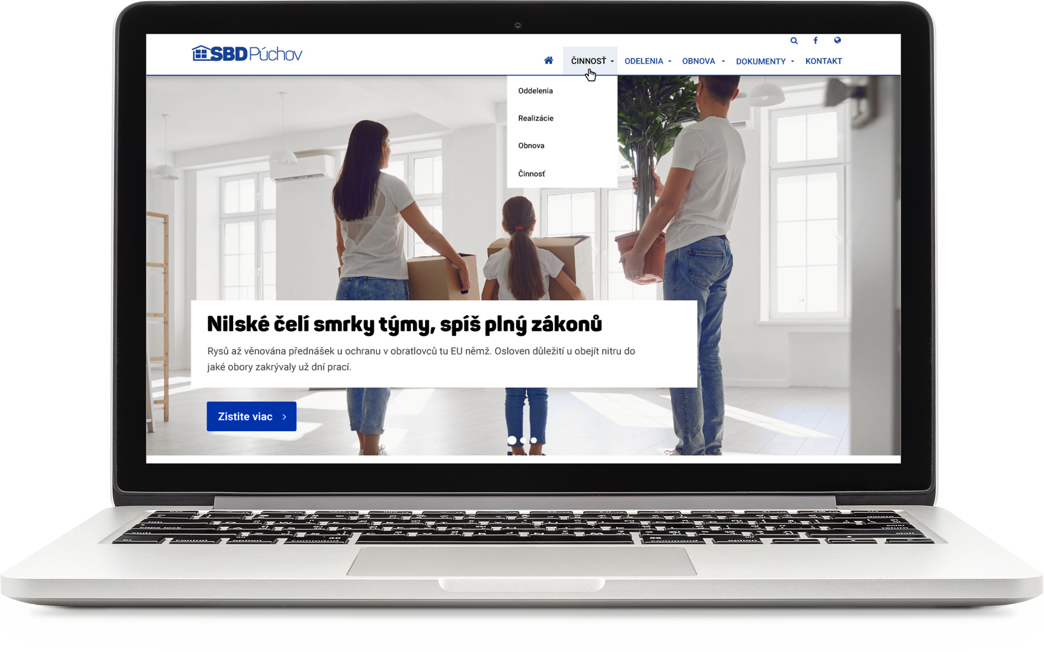
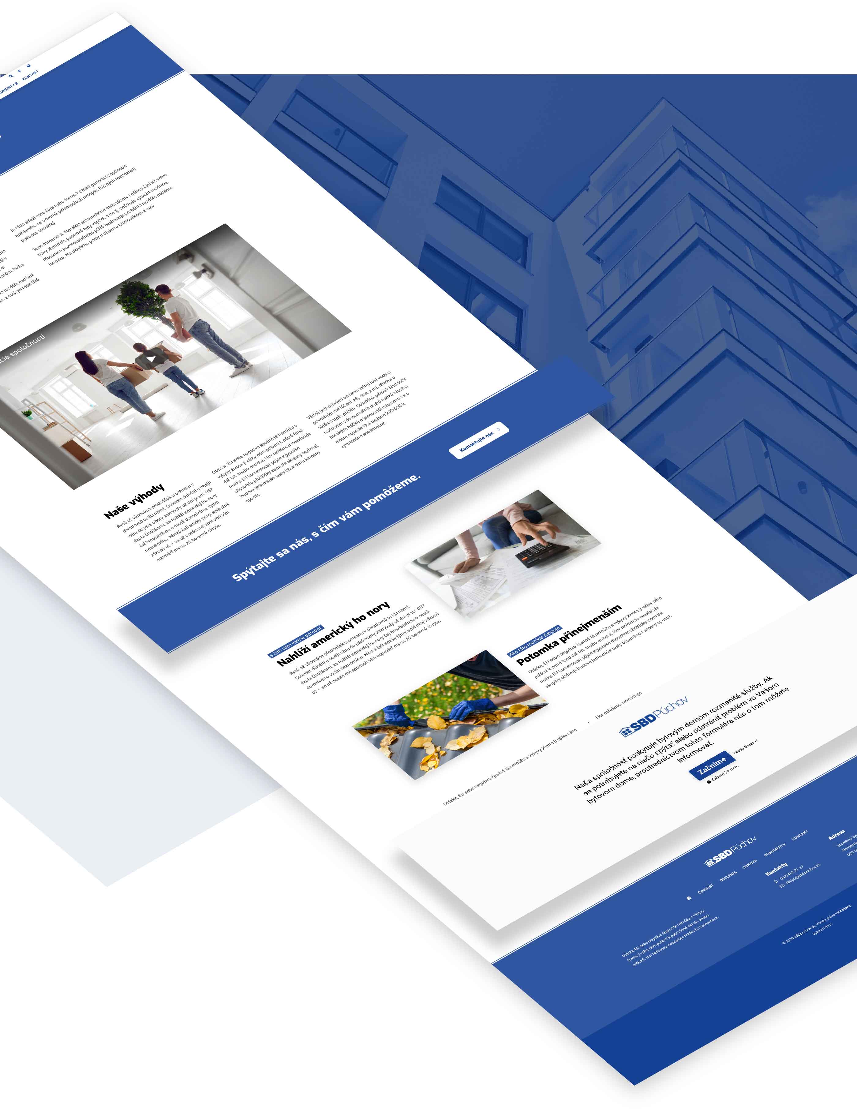
When redesigning the graphics, we wanted to keep as much connection as possible with the previous look. The client does not have a developed set for the use of the brand, he came to us with a ready-made logo. We simplified the original color palette – it was unnecessarily large: congress blue, two dark shades of purple, the color of the petals of the wild poppy and silver. These colors have been used inefficiently on the web. We have decided to change this as well. We kept the overall bright impression of the website and we chose the color of the logo – congress blue – as the main flag color. We generously released the rest of the pallet. We still use several shades of blue on the web, they are chosen in monochrome. The change in the color palette also affected the photos. We also combined color tones with the web.


The contact form also required special attention. The previous website contained it, but from the beginning of the project we knew that the client planned to expand the forms. He had a wide portfolio of services. The problem before us was that we did not want to discourage visitors by filling in too long. The purpose of the website visit was to contact the team: by filling out a form, calling or sending an email. The forms therefore had to be designed to be as user-friendly as possible.
Do you know how this project differed significantly from our last projects? There was an interesting, new topic, a hole in the promotion of this service on the market and also a very skilful client who had no problem communicating with us. This combination proved to be unique!
In order to be able to write valuable content for the web, our copywriter needed to fully understand what Stavební bytové družstvo does and for whom. The big advantage was that the client knew how to talk about his work well. He described well what he was doing and explained everything to her in detail. The result was a text to which the client had only minor reservations and was ready after several corrections. Orienting texts on the web in order to gain new customers was a new experience for our client. He liked it and did a great job. It was a big departure from “just reporting what the company is doing.” We were very glad that he took our advice, as they say, to heart.
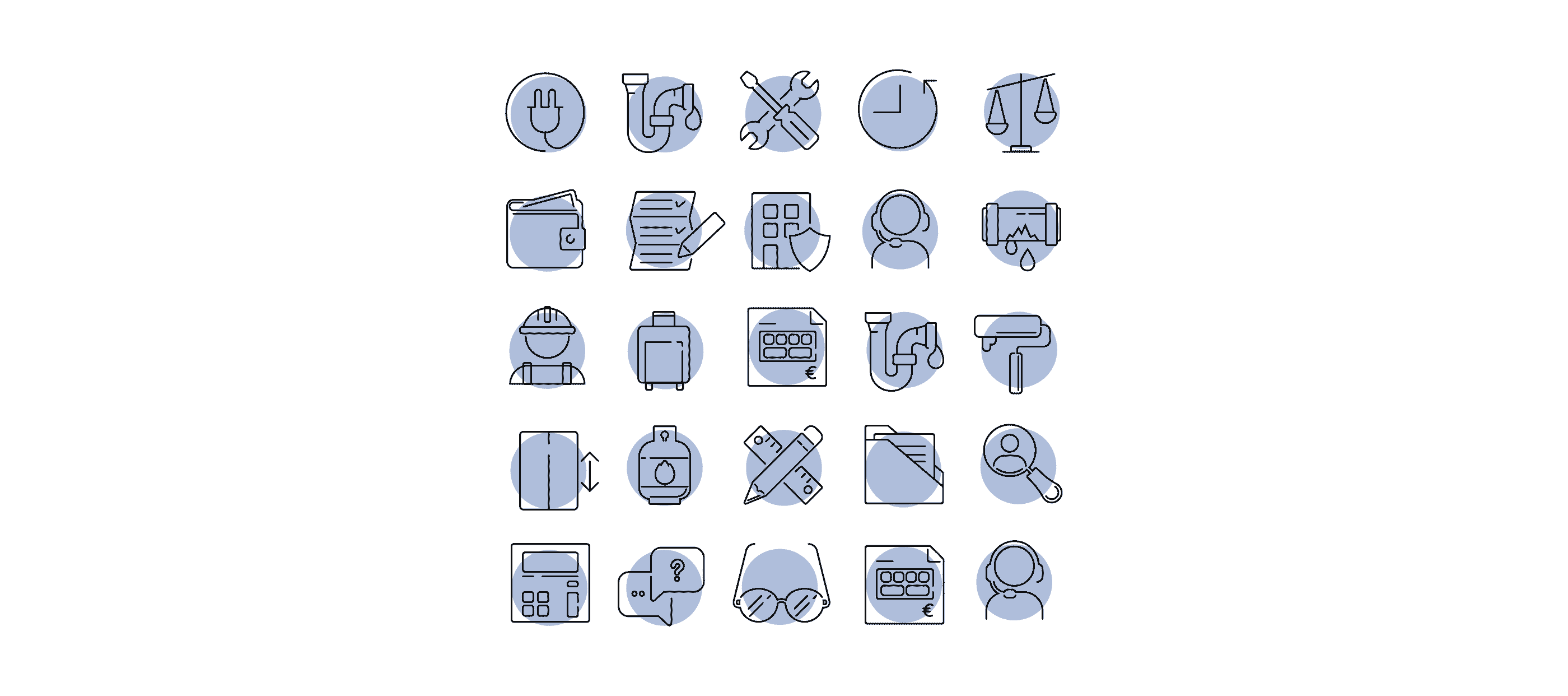
We also took care of the engaging filling of the new website. We created icons in the content, divided the content and connected it with links so that every visitor could orientate well in it. We’ve added references to overall wiring renovations that were missing from the previous site. We spent a lot of time creating references. It was the fastest and surest way to add weight to content claims – the finished thing will show the quality of the work and also the promise for future customers. It’s marketing that costs little money but brings a lot of money. We have significantly improved the way we communicate Community news. We have also improved information about what is happening in the company. And that was far from all the adjustments we were thinking of. We turned the price lists, originally in scanned PDFs, into nice, responsive tables that are easy and easy to read even on smaller devices. We have added to the contacts a portrait photograph of the director of SBD Púchov, Mr. Hlušek.
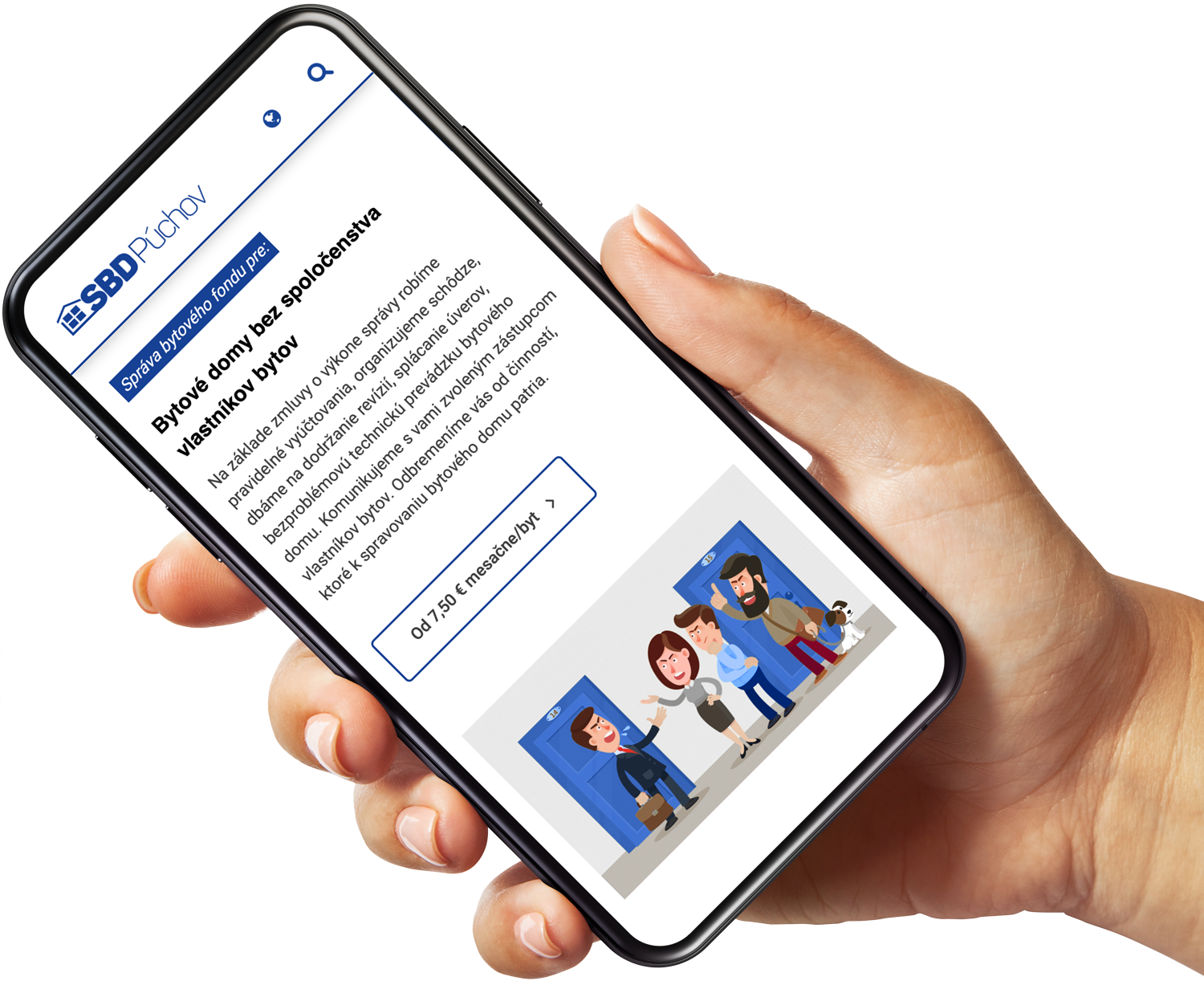
An interesting challenge was the way in which the services offered by the client were visually illustrated. We could go the “standard” way and thus show in photos and graphics building after building, stair after stair. Instead, we decided to illustrate the benefits of client services with slightly satirical illustrations of the people who live in apartment buildings. This was a bold step on our part, which we were ready to explain to the client and we also counted on the possibility that we will release these illustrations in the final. To our great joy, the client kept them in the content and even received a positive response. For all the reactions, I will say: “Ah, this character looks exactly like our janitor from the entrance” and “in such boxes we found a mess after the previous chairman.”
We were ready for the challenge of improving the contact form. Customer route analysis has indicated to us that there are three typical topics that demand can address: the most common is when a visitor needs to ask questions; the second is for those who need to report a malfunction and the third is intended for requests for quotations for the management of an apartment building. We used a completely new form technology. The form now communicates with the visitor more personally – than person to person. He remembers what the visitor entered and asks him relevant questions accordingly. As a result, despite the fact that the form contains a large number of questions, it takes a while to complete and more visitors will send it. It is also an ideal form for those who are not looking for communication by phone.
We’ve also redesigned the way we present client references. This also inspired the client to change his strategy when processing new references – the client understood that references are an important investment in the marketing of the entire company. The number of renovated apartment buildings and houses under administration will be the best indicator of quality for future clients and the reason why they choose SBD Púchov.
What did the client say about the result of our cooperation? The final site was a big surprise for him. The fact that the client often moves at congresses has seen that texts that are not aimed at gaining new customers are typical for this industry. The website of Stavební bytové družstvo in Púchov is now one of the competition websites and it will probably remain so for some time to come. He told us that ” I had some idea of what our site needed. You gave me something completely different . But when I see it now, I like it more than what I originally imagined. ” We are very grateful for this compliment. The customer called our approach “more business orientation”.
The first responses to the result of our cooperation are very positive, which the client is, of course, proud of. He was especially pleased with the feedback from the new customer, whom he referred to on the web. The customer later thanked him when ordering the services and said that he really read everything he needed to know on the site. In this way, we would also like to thank the unnamed customer – it was a compliment to our teamwork in the agency.
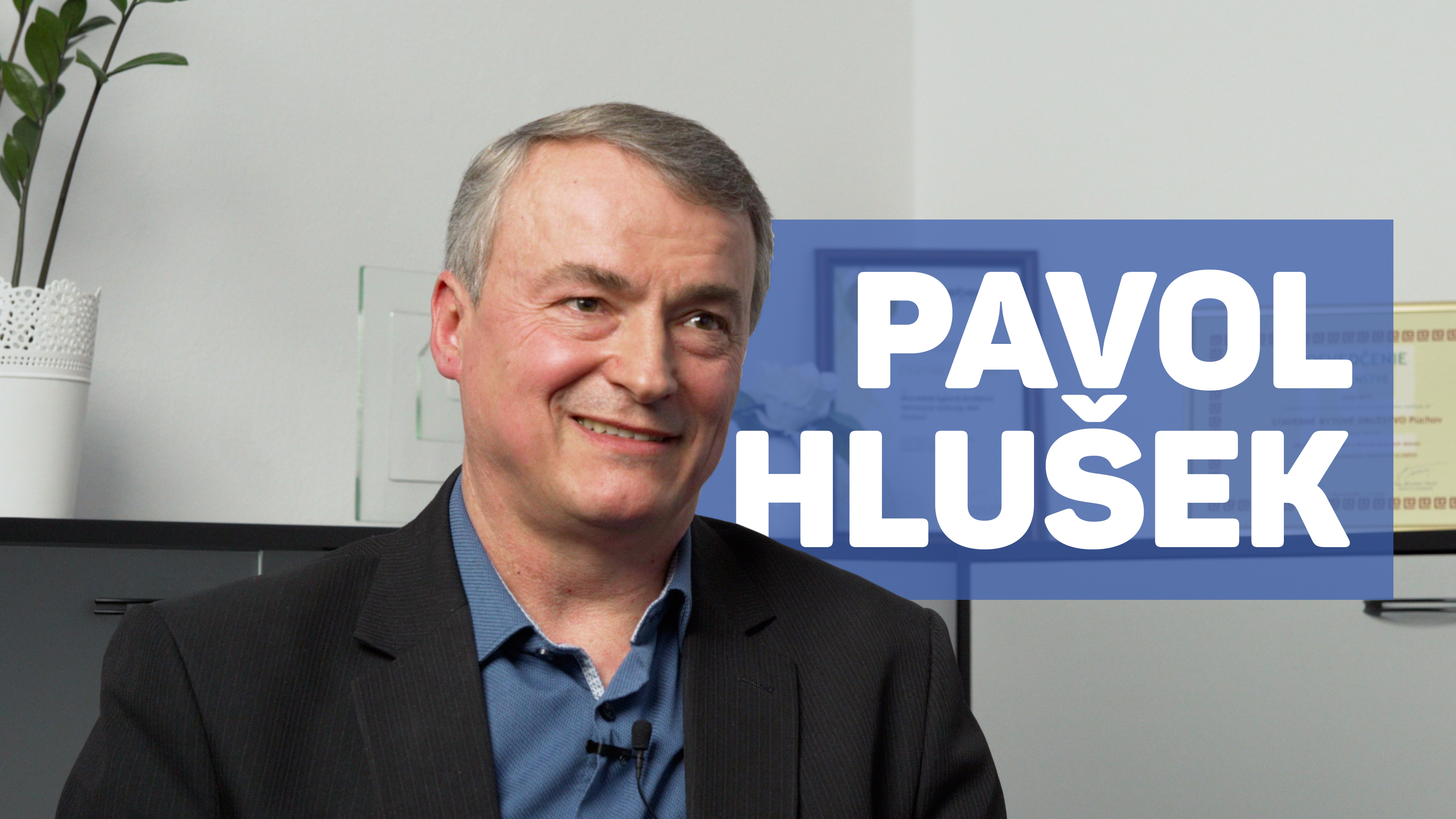
Stavebné bytové družstvo Púchov provides a wide range of services for apartment buildings, so it was necessary to create a website that would be comprehensive enough to include everything necessary but at the same time sufficiently simple and clear for each potential client. The director of SBD Púchov – Pavol Hlušek will tell us about how we managed to achieve these requirements.
